5 web design features to avoid on your Squarespace website
Website design is one of my favourite subjects here on the blog and I love to cover it all - the good, the bad and the ugly.
Your website is often the first point of contact people have with you and your business, and it really does set the tone with how your brand is perceived online.
While your website will evolve and be updated over time, there are several features that you should avoid at all costs! Outdated technology and web design paradigms are usually the culprits when it comes to brutal web design choices.
So consider this some free professional advice - don’t make these 5 design mistakes on your Squarespace website if you want people to like your site and do business with you haha!
Ready to get started? Great! Let’s take a look.
Want to build, design and publish your own Squarespace website? Sign up for my free 7 day email course, Launch Your Best Site!
Mistake #1: Old-School Mobile Sites
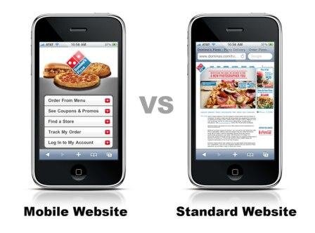
You know the ones I'm talking about...those awkward sites that display when you're browsing the web on your phone or tablet. The image below shows the difference between a responsive site viewed on mobile (left) and an out-dated website viewed on mobile site (right).
The site might even have an entirely different URL (for example, m.sitename.com) which is confusing to both users and search engines like Google.
Mobi sites are brutal for many reasons, notably that they do not accommodate all device sizes and shapes, and they do not work well with SEO.
The current standard of mobile compatibility is responsive design and if anyone ever tries to sell you on another type of mobi site, run far and fast!
Whether you opt to work with a web designer/developer or customize a Squarespace template yourself, there are so many options to include responsive design that you should never have to sink so low as the mobi site.
Also, FYI, all Squarespace websites are automatically set up to be mobile responsive - this means you can pick any of their templates and you don’t have to worry about this mistake. Yippee!
Related: Squarespace SEO & Responsive Design Guide (freebie)
Mistake #2: Narrow Website Design
Whenever I see narrow little website designs that have several inches of blank space on the left and right sides, I automatically know that these sites are dated and not well cared for.
Given that so many people browse or large laptops and desktops nowadays, these narrow designs date themselves the second the page loads. Back in the day, monitors were often much smaller so sites were built to be 1024 pixels wide. Those days are gone and displays are often 1900 px wide and display in high resolution!
We've already mentioned the benefits of responsive design above, but this is another case where RD presents a contemporary site.
Since responsive websites automatically expand to fit the size of the screen, there's no need to build sites that don't fill the page correctly.
See the image below for an example of a site that has a narrow build with lots of extra space on the sides (click to enlarge, image via):
Mistake #3: Metaphorical Photos
These photos were ~totally on trend~ back in the late 90s so it blows my mind when businesses are still using these dated stock images on their sites!
Some businesses will take the easy and cliched route of putting an image of a chess board (usually in black and white for added serious effect) next to text about how "strategic" they are.
Or perhaps they'll talk about how different they are by including an image of a dog with a mohawk (see image below).
These stock photos are painfully obvious and since they are usually free or purchased for a couple of dollars, it shows that the web design was hardly considered.
Related:
Mistake #4: Unwanted Music
There's nothing more annoying (and potentially embarrassing) than browsing online when all of a sudden, you open a website and it starts blaring music. This can be either native audio on the site or from a 3rd party ad. Hello, you're not Adele and no one wants to hear you!
I would wager than 99% of all site visitors are not interested in hearing unsolicited music on your site. Keep your site design simple (and silent!), and free from ads that will start playing audio without being initiated by the user.
If a visitor has to mute your site, there's a high chance they won't return.
Mistake #5: Complicated Contact/Registration Forms
It's important to remember that users are on your site in order to get information they want, not the other way around! If these people want to get in touch with you (whether through your Contact page, or by signing up for your newsletter), don't make it so complicated that they turn away or get discouraged!
The contact form that you're using should be a very simple contact form that captures only the necessary information.
Related: How to add and customize a form on your Squarespace website (video tutorial)
I recommend collecting their First Name and Email Address, and if you think you need to get additional information, you can always add those fields to the form too. But before you do, ask yourself - is it really necessary?
The more required fields and validations you have in place, the more likely the user is to be frustrated away from finishing their inquiry or sign up.
The image below shows a simple Squarespace contact form. Note how simple the fields are and how there are only two basic required fields (click image to enlarge):
Final Thoughts
If you decide to build your website on Squarespace’s platform, you automatically don’t have to worry about mistake #1 or #2 - phew! But the other 3 mistakes are still something to consider, so be aware of these features before including them on your site.
And if you have any of these mistakes present on an existing site? Simply remove them haha!
You might also like:
Now it’s your turn to tell me, what are some of your biggest pet peeves when it comes to web design? Have you had to make changes to your website recently in order to fix those mistakes? I'd love to know so leave me a note in the comments below!


